CSS transforms the appearance of web pages by controlling layout, colors, fonts, and spacing. Visualizing CSS principles through an infographic helps simplify complex coding concepts for both beginners and professionals. This graphic representation enhances understanding of selectors, properties, and responsive design techniques.
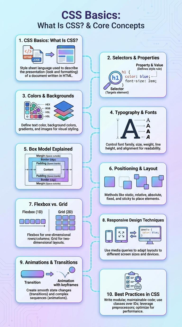
CSS Basics: What Is CSS?
CSS, or Cascading Style Sheets, is a stylesheet language used to describe the presentation of a web page. CSS controls the layout, colors, fonts, and overall visual design of HTML elements.
- Purpose of CSS - Defines how HTML elements are displayed on screen, paper, or in other media.
- Separation of Concerns - Keeps content (HTML) separate from design, improving maintainability and flexibility.
- Selectors and Properties - Use selectors to target HTML elements and apply style properties like color, font-size, and margin.
CSS is essential for creating visually appealing and user-friendly websites by enhancing the appearance beyond plain HTML structure.
Selectors & Properties
| CSS Selectors | Description |
|---|---|
| Type Selector | Selects all elements of a given type. Example: p targets all paragraphs. |
| Class Selector | Targets elements with a specific class attribute. Example: .container selects all elements with class="container". |
| ID Selector | Selects a unique element with a specific id. Example: #header targets the element with id="header". |
| Attribute Selector | Matches elements based on attributes. Example: a[href] selects all links with an href attribute. |
| Universal Selector | Targets all elements in the document. Example: * applies styles globally. |
| CSS Properties | Description |
|---|---|
| color | Sets the text color of an element. Example: color: #333; |
| background-color | Defines the background color of an element. Example: background-color: #f4f4f4; |
| font-size | Controls the size of the text. Example: font-size: 16px; |
| margin | Specifies the space outside an element's border. Example: margin: 10px; |
| padding | Defines space between element content and its border. Example: padding: 15px; |
Colors & Backgrounds
What role do colors and backgrounds play in CSS? Colors and backgrounds in CSS are essential for defining the visual style and mood of a webpage. They enhance user experience by improving readability and creating aesthetic appeal.
How can you specify colors in CSS? CSS allows colors to be set using named colors, hexadecimal codes, RGB, RGBA, HSL, and HSLA values for precise control. Background colors and images can be combined to create dynamic and visually engaging page layouts.
Typography & Fonts
Typography and fonts are essential components of CSS that define the visual style and readability of web content. CSS allows designers to customize font family, size, weight, and style to enhance user experience.
Key properties include font-family, font-size, font-weight, line-height, and font-style. Proper use of these properties improves accessibility and ensures consistent text presentation across devices and browsers.
Box Model Explained
The CSS Box Model is a fundamental concept that defines the structure of elements on a web page, consisting of margins, borders, padding, and the content area. Each layer impacts the element's size and spacing, allowing precise control over layout and design. Understanding the Box Model helps developers create visually appealing and well-structured web interfaces.
Positioning & Layout
CSS positioning and layout techniques control the placement and organization of elements on a webpage. Mastering these properties ensures responsive and visually appealing designs.
- Static Positioning - The default position where elements follow the normal document flow.
- Relative Positioning - Offsets an element relative to its original static position without affecting other elements.
- Absolute Positioning - Positions an element relative to its nearest positioned ancestor, removing it from the document flow.
- Flexbox Layout - A layout model enabling responsive arrangements by distributing space along a single axis.
- Grid Layout - A two-dimensional layout system allowing precise placement of elements in rows and columns.
Flexbox vs. Grid
CSS offers powerful layout modules like Flexbox and Grid designed to create responsive and flexible web designs. Each serves unique purposes in organizing content efficiently within web pages.
Flexbox specializes in one-dimensional layouts, either in a row or column, making it ideal for aligning items along a single axis. Grid provides a two-dimensional system that enables precise placement of elements both in rows and columns. Together, these modules enhance design capabilities for complex and adaptable interfaces.
Responsive Design Techniques
Responsive design is essential for creating websites that adapt seamlessly to various screen sizes and devices. CSS techniques enable developers to build flexible layouts that enhance user experience on desktops, tablets, and smartphones.
Media queries allow precise control over styles based on viewport dimensions, ensuring content adjusts fluidly. Flexible grids and scalable images work together to maintain consistent design and readability across devices.
Animations & Transitions
CSS Animations enable smooth changes between CSS property values over time, enhancing user interface interactivity and visual appeal. Transitions allow gradual shifts from one state to another upon user actions such as hover or focus, providing dynamic feedback. Key properties include animation-name, animation-duration, transition-property, and transition-duration, controlling timing and behavior.